Introduction
The Core Web site is designed to detect the type of device you are visiting with, and adjust its layout accordingly. When visiting from a mobile phone or tablet you will still have access to nearly all of your normal desktop functionality but in a conveniently portable way. All Core workflows remain the same but are represented visually in a different way. The following information provides an overview of commonly used functionality
Logging In
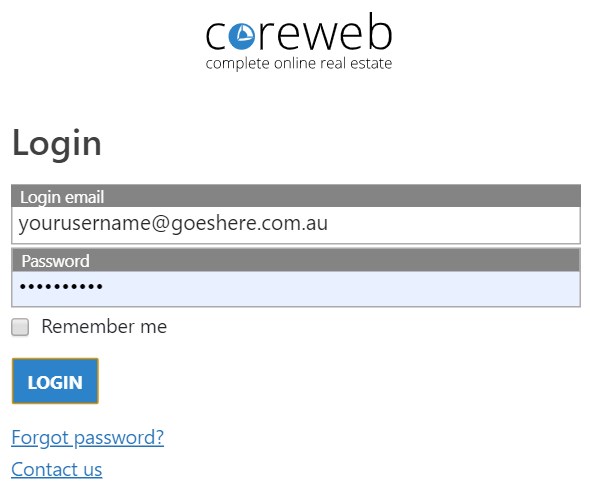
Visiting admin.coreweb.com.au will take you to the login screen. Enter your normal credentials and press “Login”
Main Navigation
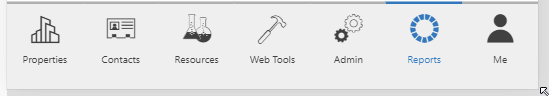
Use the main navigation menu at the bottom of your screen to move between key areas of Core.
Side Slide Menu
Once in your key area, access the Actions, Activities, Marketing, Admin and Reports screens by pressing the expansion arrow top left of your screen. From here you can move between the menus by pressing plus + or minus -. Press on the arrow again to hide and maximize your viewing window.
Filters

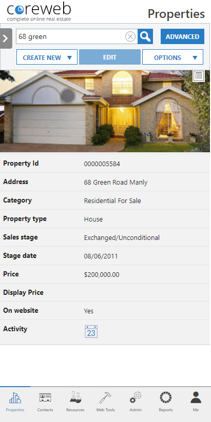
Because space is a premium on your smaller mobile screen you can filter what information you want to see. Press the filter button  at the top right of your screen to personalize. These options change dependant on which screen you are in.
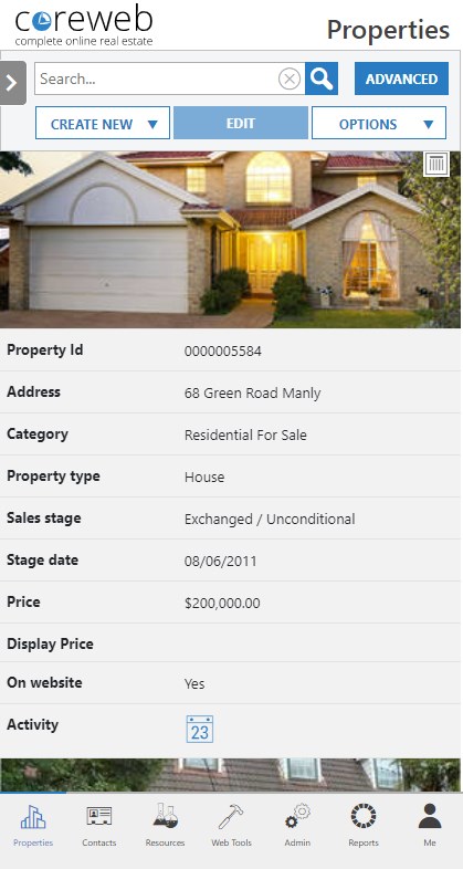
Details Area
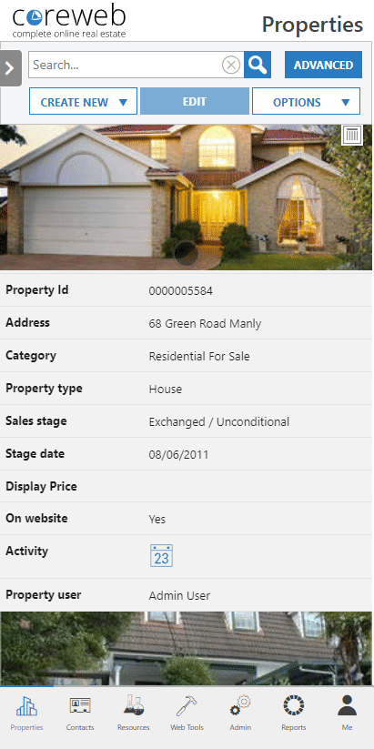
The Details area displays your filtered information. You can scroll up and down and highlight items by pressing on them once. Once highlilghted, the options at the top of your screen may become available. An example of this is the Edit button.
Return To Desktop Mode
Newer IOS / Safari Devices
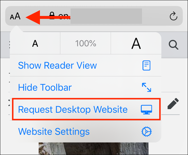
Via the “aA” icon
Older IOS / Safari Devices
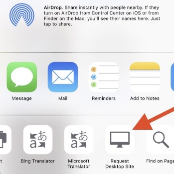
Via the “Activity” icon
Via the “Hamburger” icon in Chrome
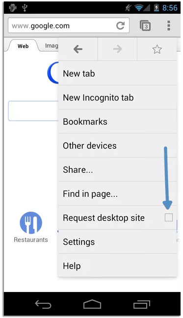
If you prefer the Desktop view, you can always return to it on your mobile device. Just set your browser to request the desktop site.