Purpose
This is where you design your master templates and will be the basis for your content. Once editing the templates you can create a wireframe with “sections” which can be considered buckets for information, and “components” which all have a different function and get placed inside the section. The beauty of the Core system is that our components can all read from information that has been entered into the property. This includes things like Vendor name, property address, your team, your profile, pricing, recent sales, your marketing plan, testimonials… the list goes on and will continue to be updated. Once you have perfected your proposal template, you move on to creating the proposal that is unique to your property.
Instructions
Note: Before you start, please ensure that you have spoken to the Core support team and have a Brand Style set up for Proposals. Without this the feature will not work. Also, before continuing, it is recommended to familiarise yourself with the fundamentals of how the system works here
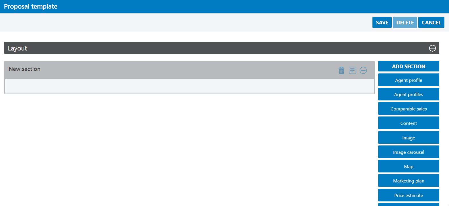
- To start, click on Proposal templates under the Marketing Admin menu. You will be taken to a screen similar to below.
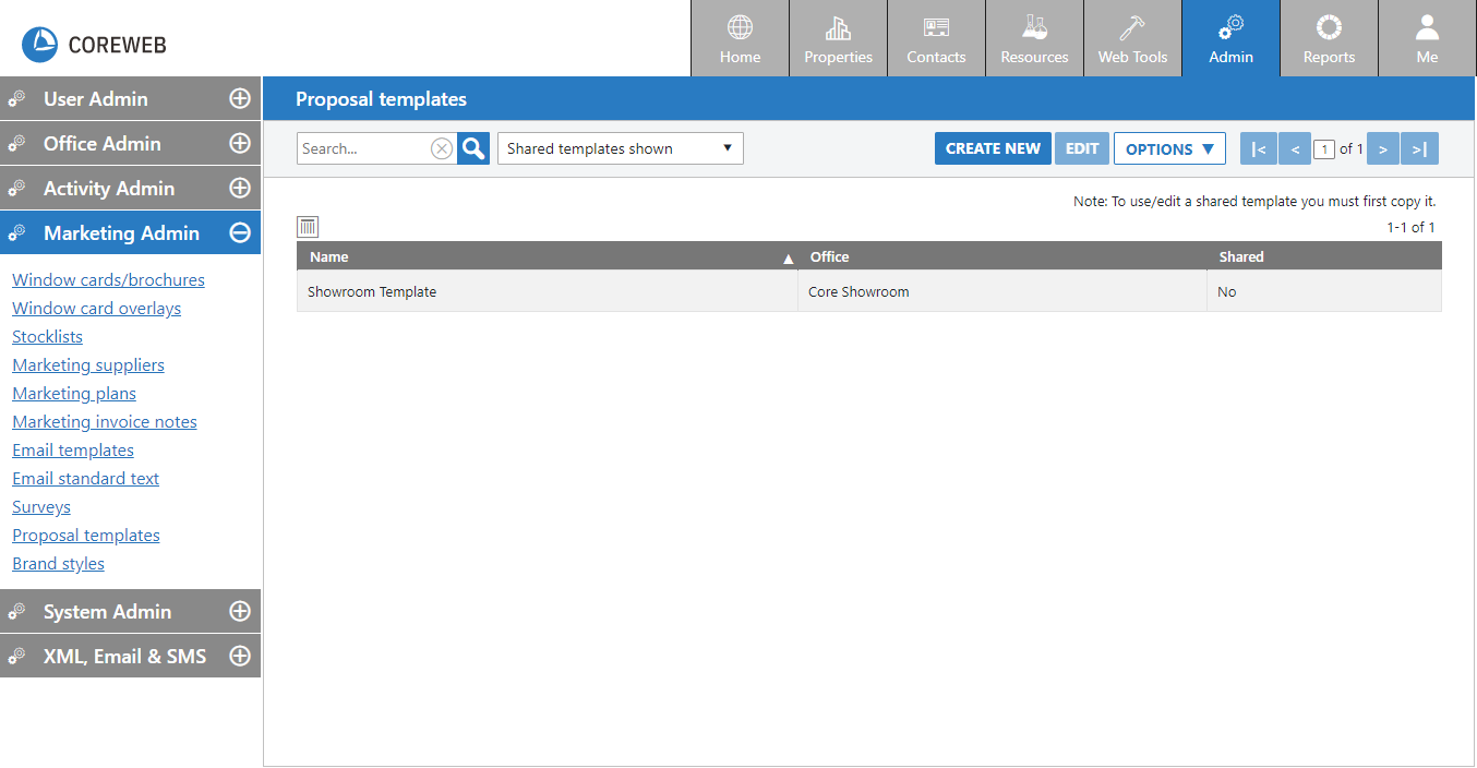
- On the main proposal screen you can Create new, search, edit, export proposals or import new ones. In this guide we will focus on creating a new template. If others have created proposal templates in your organisation and they are shared with you, they will appear here. You can choose to see them, or hide them with the dropdown option.
- To start, click the Create New button
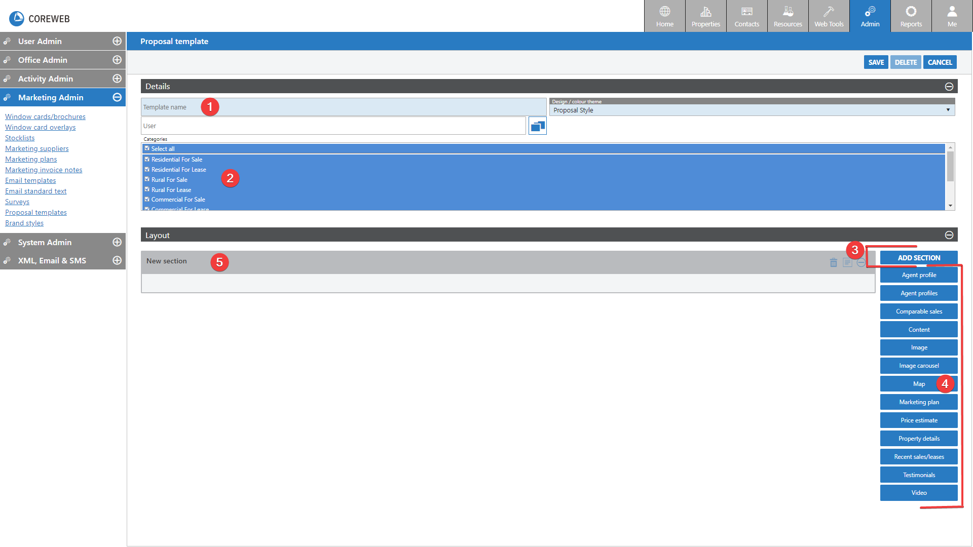
- You will need to give your template a name. Consider whether you are personalising it for one person to use or making something for the entire team. Ensure that the name you give it accurately describes the template as it will be used from now on to identify it.
- Select the property categories you wish to associate the template with. You can leave it default and applied to all if you wish.
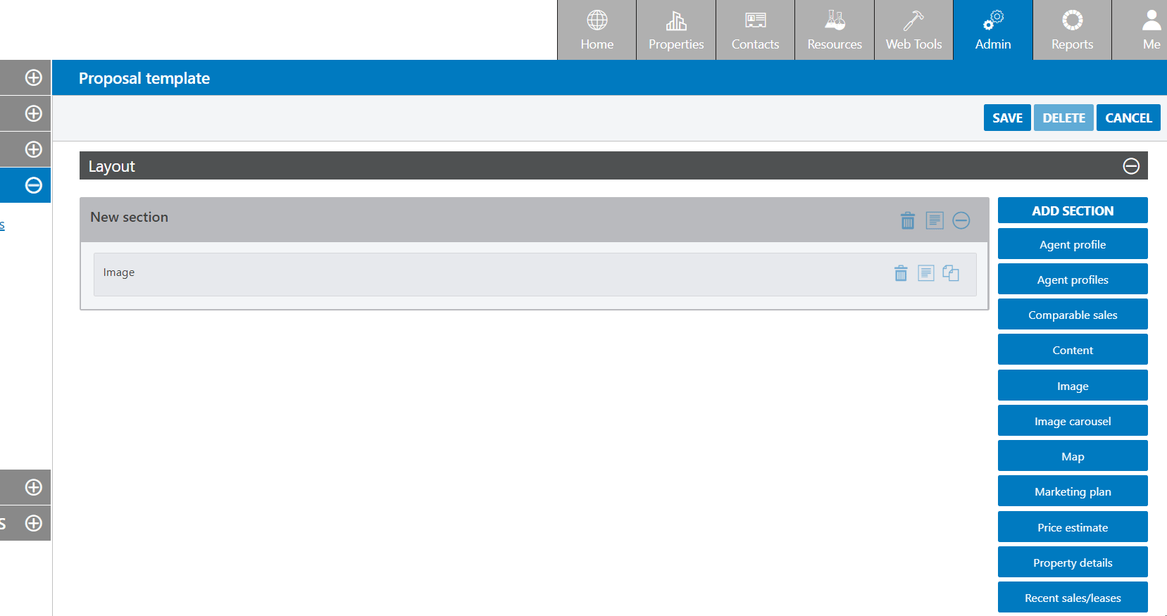
- Add sections to the template to break up your design
- Drag components into the sections to further form your layout and content
- An empty section will be added by default on the creation of a new template
Note: It is important at this stage to cover the styling of a section. This is accessed by clicking the Edit / Options button at the top right of the section:
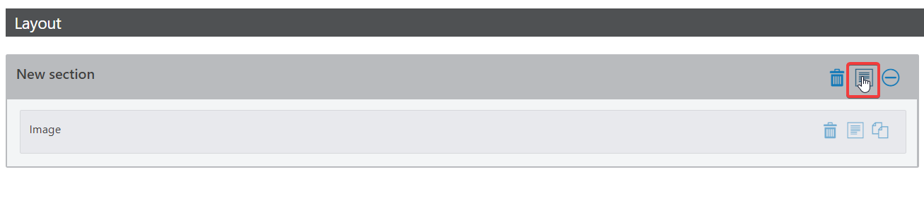
- After clicking this button you are presented with the Details tab for the section’s options:
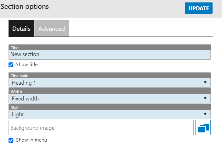
- A breakdown of these options is as follows:
Title – The name of the section. This helps you to identify it in the editor, but also can be used to be displayed in the proposal by using the option below
Show Title Tickbox – Ticking this means that the title given above will appear visible in the proposal
Title Style – Relates to the Brand Style that must have been preconfigured for you. As an example, Heading 1 will typically be your largest sized font.
Width – Either Full width of fixed width. Full width will use the entire page, while fixed width will appear more centered on the page with background on each side
Style – Typically either light or dark. This relates directly witht he Brand Style setup
Background Image – You can add a photo to appear in the background of the section. Any components will sit over this image, similar to the way an icon on your desktop hovers over your background wallpaper.
Show In Menu Tickbox – All proposals have a menu system on the left hand side. Ticking this means that the Section’s title will appear in this menu and be clickable. Clicking it will take the user to that part of the proposal.
- The second tab in the Edit / Options area is the Advanced tab:
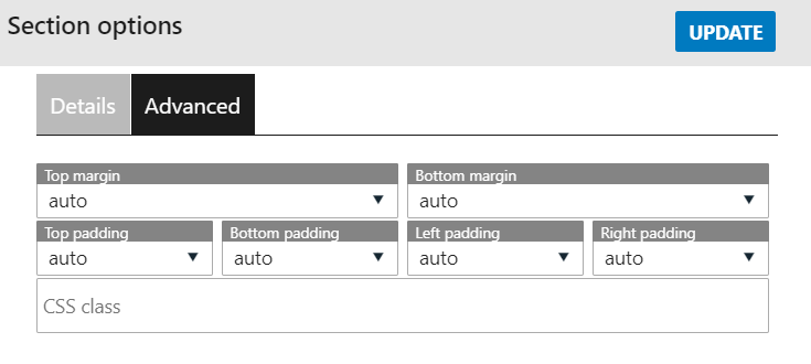
As titled, this area contains advanced settings. A breakdown of the terms used:
Margin: the space outside a section. Modifying this either increases or decreases this space
Padding: the space inside a section. Modifying this either increases or decreases this space
CSS Class: only use if you’ve received specific instruction from Core.
- Now that the styling for the section has been set up you can work on placing information inside it. A section is designed so that you can drag components into it. This is done simply by clicking and holding the left mouse button down, dragging the component into the section and dropping it. As follows:
- You can drag and drop multiple components into a section. Each component will have the same type of “style” applied to it as determined by the section. If you want a component to have different style applied to it, it is best to add a new section. Components perform different functions. A list of them is kept here.
- When adding multiple components to a section you can reorder them and also modify their size. In the first example we added an image component, next we’ll add a text component to go next to it, but shrink the size of both so that they can both exist on the same line. Components can be set to a number of pre-set sizes. Each size represents a percentage of the size of the section. They are:
1/1 or 100%
2/3 or 66%
1/2 or 50%
1/3 or 33%
1/4 or 25%
- To place two items next to each other you can use multiple combinations of sizes, but the simplest would be to set each to 50%. In the example below we will set our existing image to 50% width, drag in a new component and resize it to 50% width so that they can exist side-by-side:
Note: This way of laying out components can be applied to any of them. ie if you wish to fit 3 items, set them all to 33%, 4 items 25% etc.
- Once you have created your master template, test it out on a Property to get a better feel for the final product. If you find that the look isn’t right, it can be helpful to continue working in the WYSIWYG version of the editor to quickly see the impact. Note your changes down and then come back to edit the master template to make them permanent for all future proposals.
The above workflow can be considered for all sections, and components. The best idea is to read through the component guide and slowly make changes to your design until you are happy. You can always speak to Core support if you have any questions or need assistance.